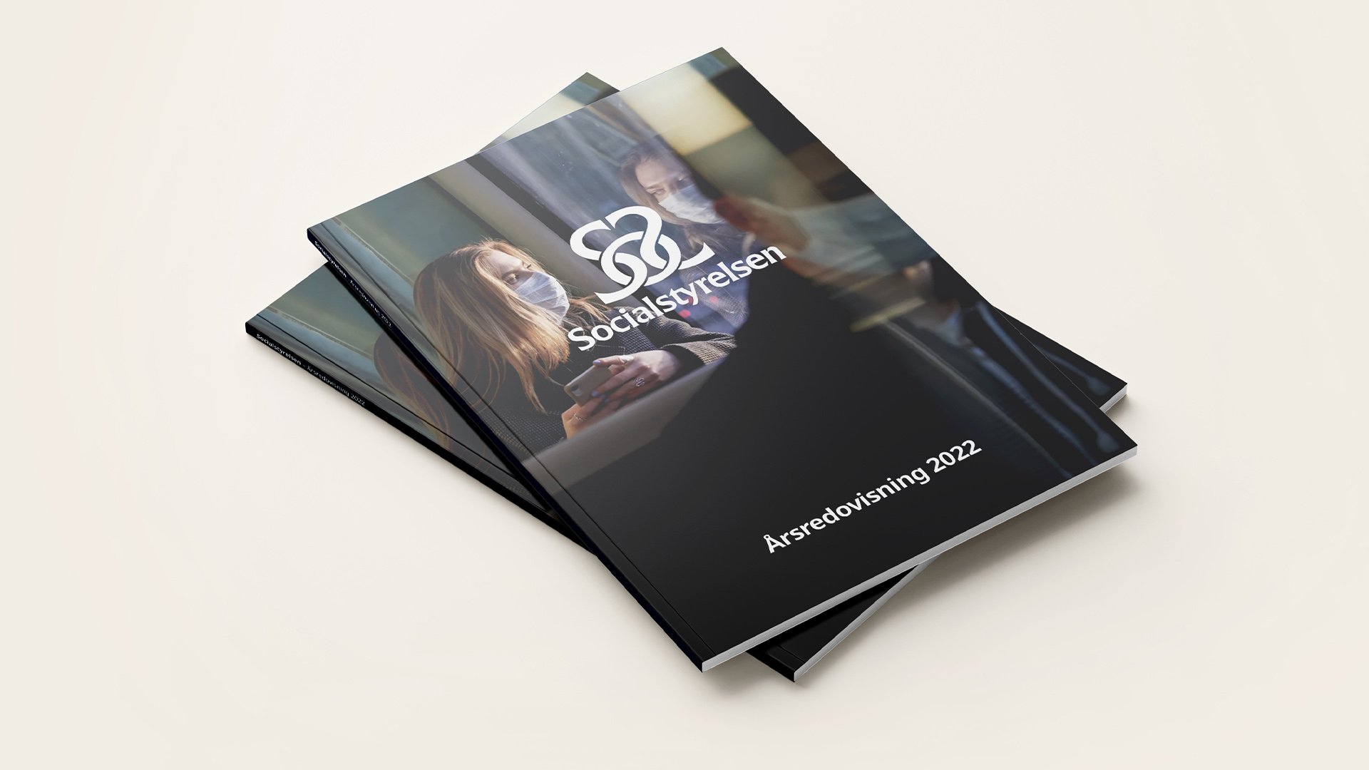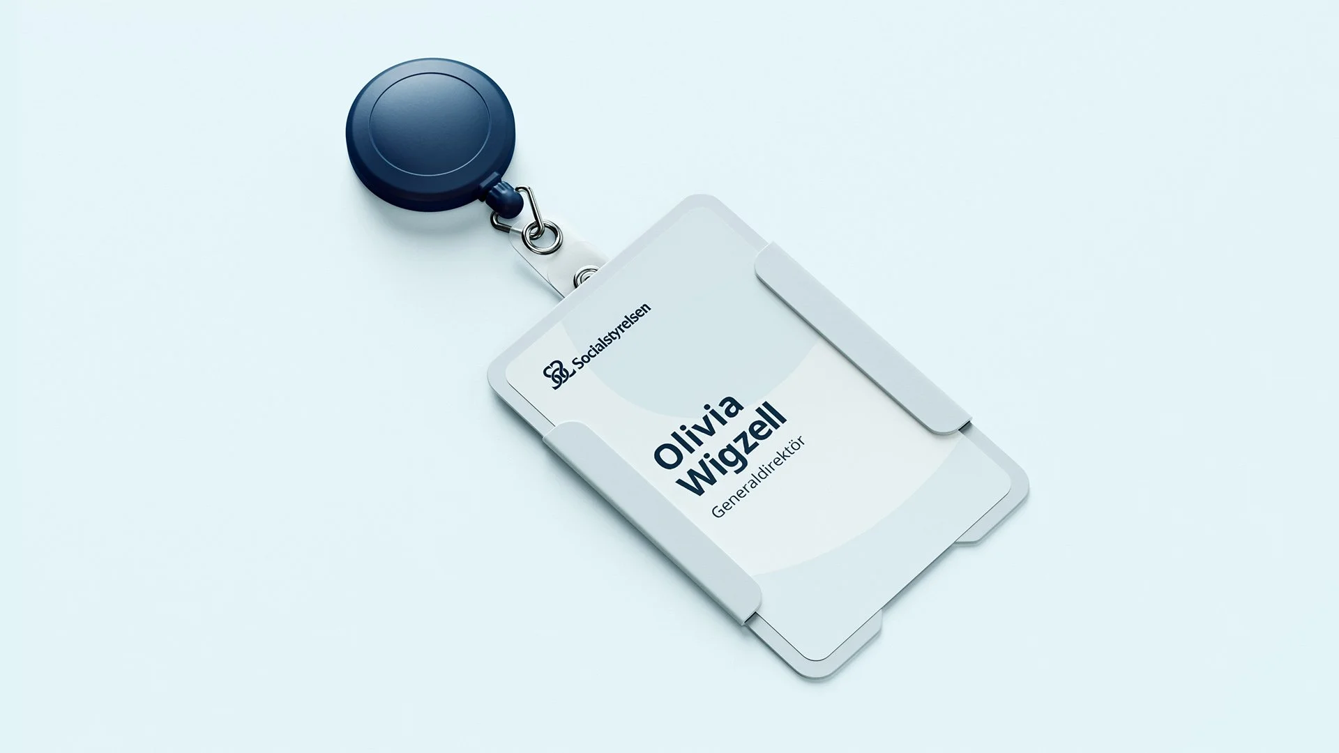

Socialstyrelsen – Inclusive Visual Identity
As Art Director at Södra tornet, I helped rebuild
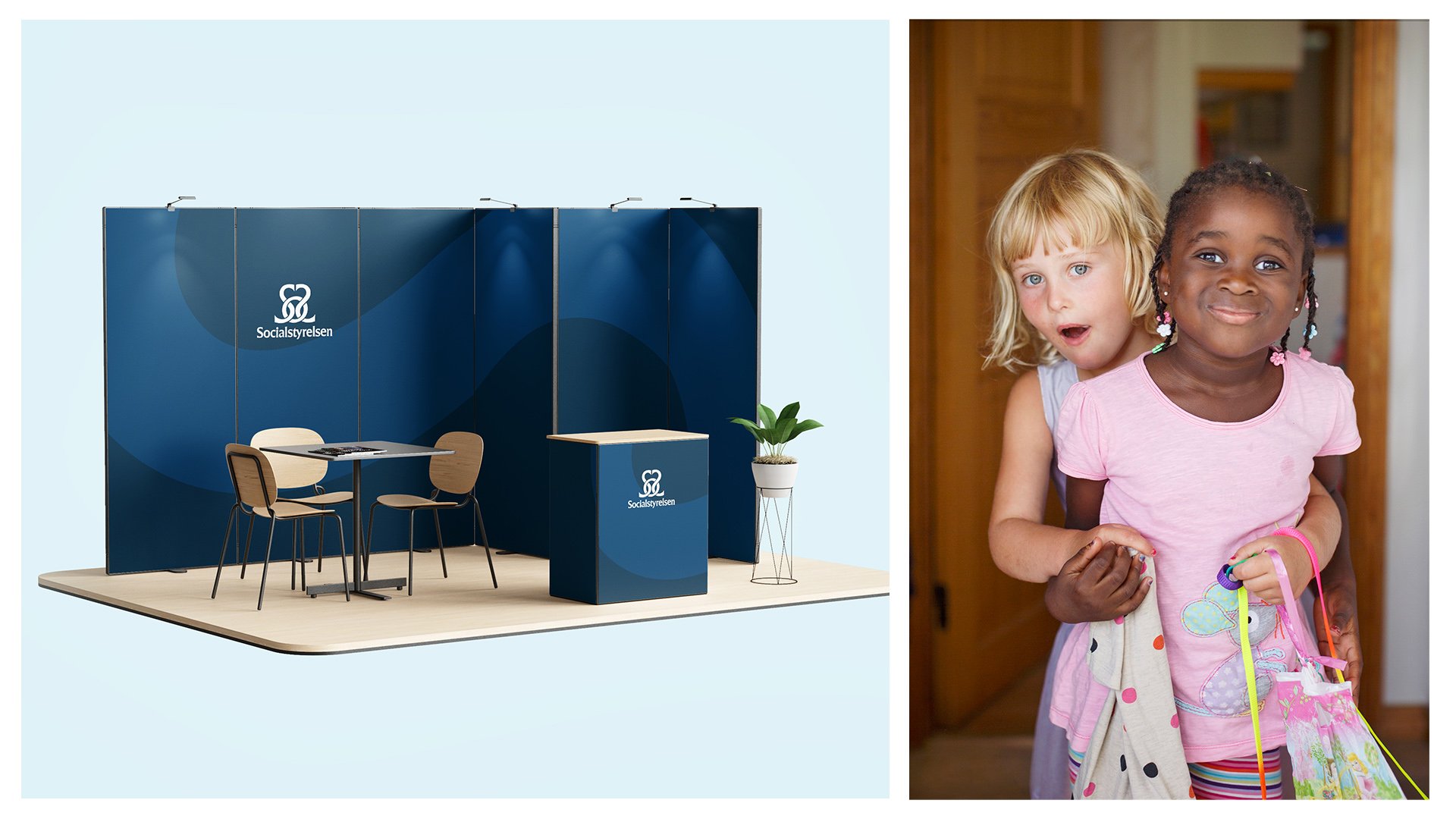
the visual identity for Socialstyrelsen (The Swedish National Board of Health and Welfare) to meet strict digital accessibility standards (WCAG) and establish a warmer, more human tone.
Key Highlights & Execution
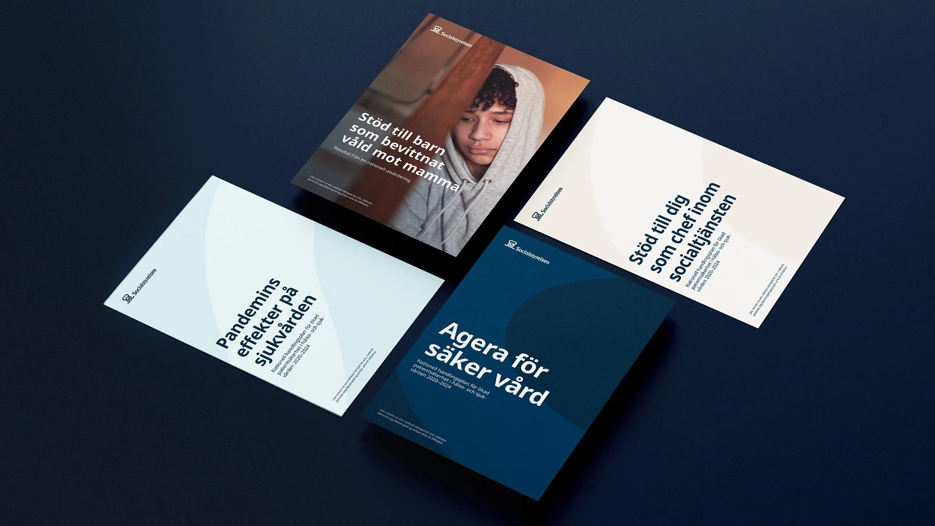
Brand Shape & Motion: Created a flexible graphic element derived from the logo to add structure and forward momentum.
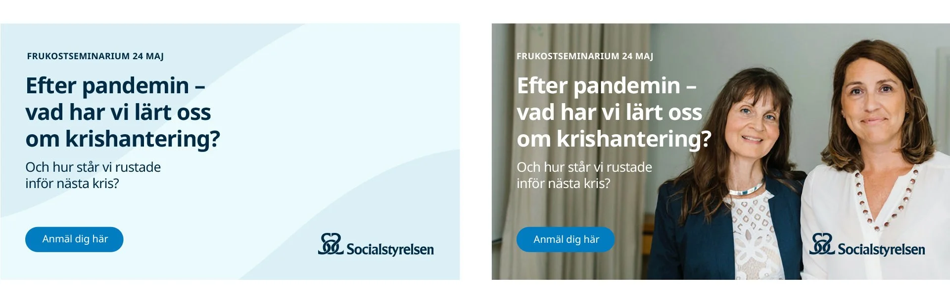
Typography: Selected Noto Sans for its blend of authority, clarity, and warmth.
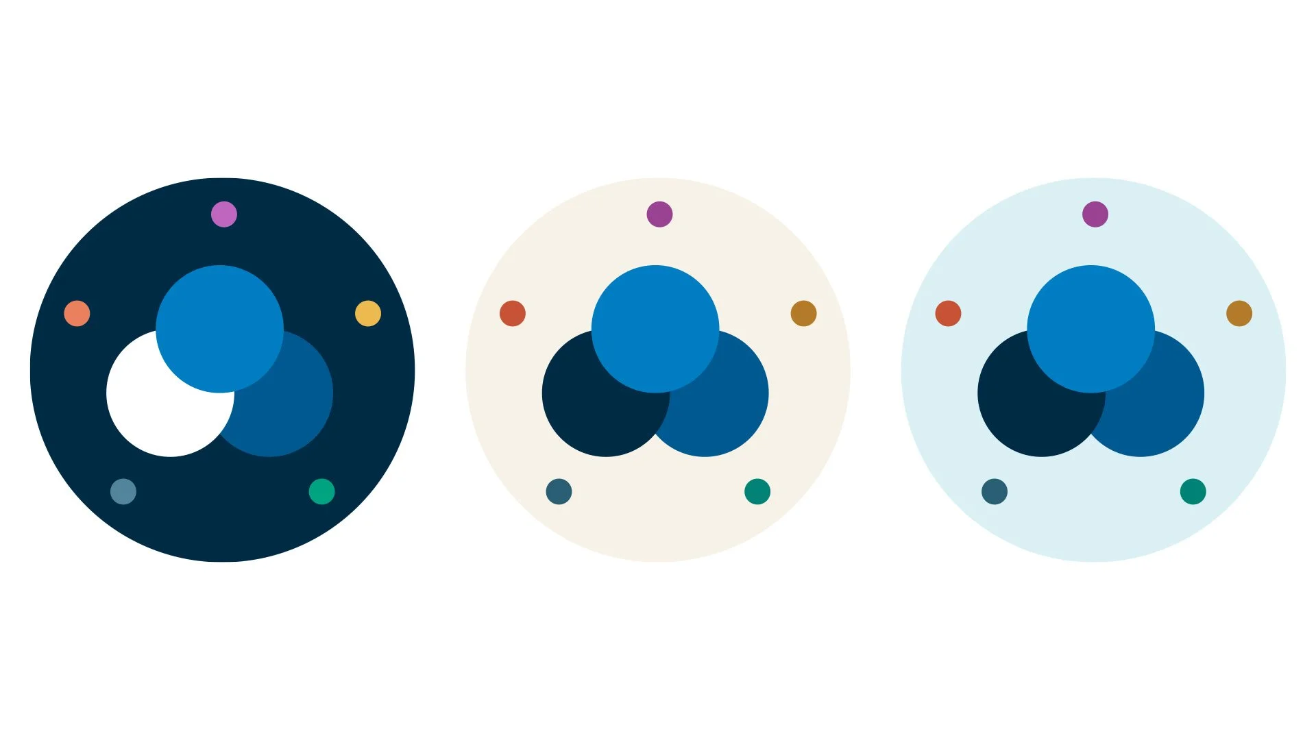
WCAG-Compliant Color System: Expanded the navy blue base with vibrant accents, soft background tones, and an accessibility matrix for internal teams.
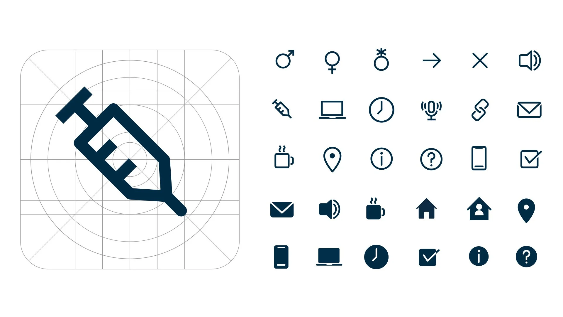
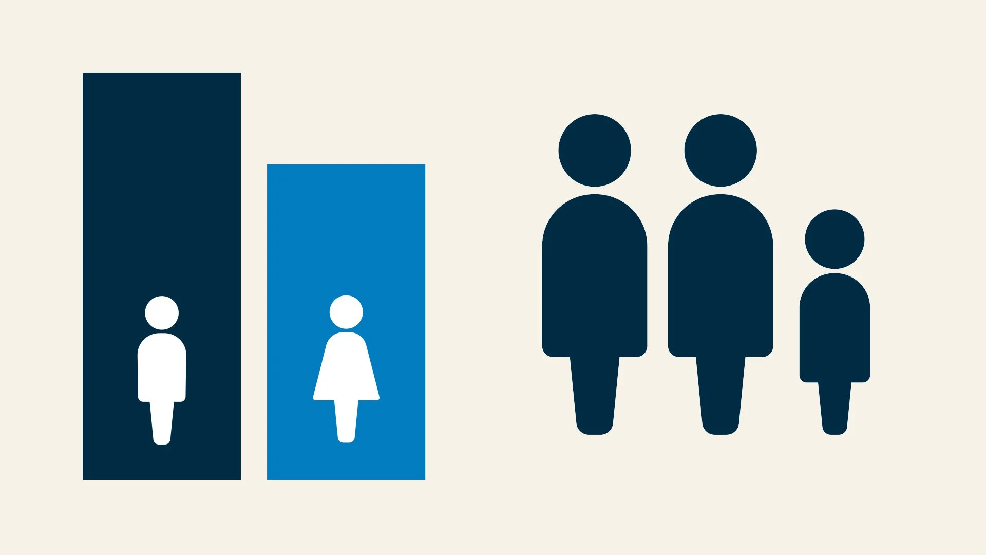
Inclusive Iconography: Designed a rounded symbol system with gender-neutral figures representing diverse family structures.
Result
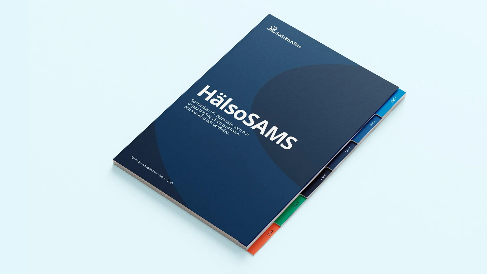
A modern, accessible design system and brand guide that builds trust across all digital touchpoint